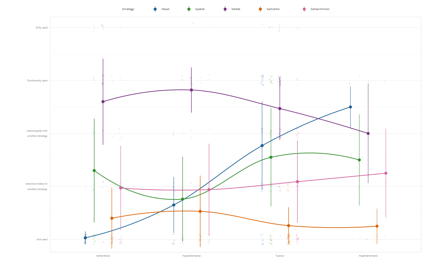
Plot mean strategy scores for groups
Arguments
- df_long
A data frame containing the strategies data in a long format with columns for grouping, strategy, and score.
- grouping
A variable to group the data by, typically group or cluster. Can be unquoted.
- title
Optional title for the plot.
- x_labels
Optional labels for the x-axis, if different from the grouping variable.
- ...
Additional arguments passed to the
theme_pdf()function for customizing the plot theme.
Value
A ggplot2 object showing the mean strategy scores for each group, with strategies as colors and filled points, and error bars representing standard error of the mean.
Examples
df_long <-
  get_clean_data()$df_survey |>
  pivot_strategies_longer()

plot_strategies_scores(df_long, grouping = group)
#> `geom_smooth()` using formula = 'y ~ x'
#> Warning: `position_dodge()` requires non-overlapping x intervals.