Create a joint matrix + graph correlation figure
Source:R/plot_score_cor_joint.R
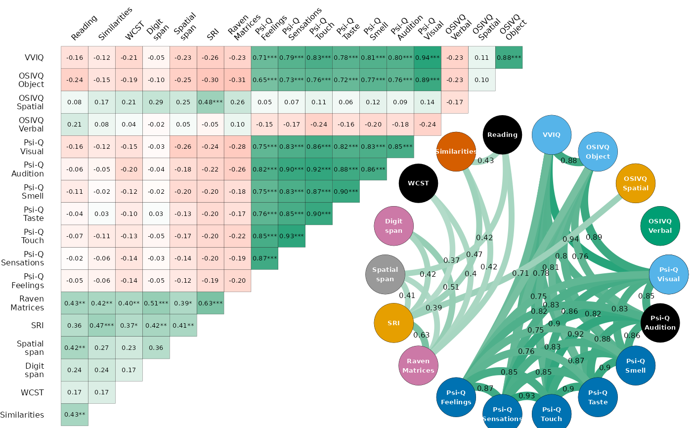
plot_score_cor_joint.RdThis function combines a correlation matrix and a graph visualisation of
correlations into a single plot using the patchwork package. While the
two underlying functions (plot_score_cor_matrix() and
plot_score_cor_graph()) are fairly generic, this function is tailored for
the study data from the article. It is recommended to use it together with
the other package functions (see examples).
Usage
plot_score_cor_joint(
  correlations,
  size_axis = 6,
  matrix_text = 5,
  shape = 21,
  stroke = 0.1,
  node_size = 14,
  node_text_size = 5,
  label_text_size = 2
)
Arguments
- correlations
A data frame containing the correlations, typically the output of
correlate_vars().- size_axis
Size of the axis text in points. Default is 6.
- matrix_text
Size of the text in the correlation matrix. Default is 5.
- shape
Shape of the nodes in the graph. Default is 21 (circle).
- stroke
Stroke width of the nodes. Default is 0.1.
- node_size
Size of the nodes in the graph. Default is 14.
- node_text_size
Size of the text labels on the nodes. Default is 5.
- label_text_size
Size of the text labels on the edges. Default is 2.
Examples
study_data |> correlate_vars(partial = FALSE) |> plot_score_cor_joint()